ATL and BTL are some of the most known acronyms for these 2 realms of communication: Above The Line and Below The Line.
Communication instruments in modern companies have evolved rapidly since the seventies (70´s), in which the ATL media had hoarded the advertising scene with approximate participation of 80% vs. 20% from BTL instruments. But along the eighties, they started to scratch this value rising up to 40% and finally with the new century became the 70% BTL vs. 30% ATL. *Salen, H. (abril, 2008). Seminario Internacional Merchandising Activo. Merchandising visual, de seducción: una necesidad actual y creciente.
This means that with the new century most companies made a bet for BTL communication: salesforce, window display, Visual Merchandising, public relationship, patronage, and sponsorship. The communication at the point of purchase (which is the one we are going to talk here in this blog) might have many topics or classifications -it depends on the author- but here, we are going to get straight to the point:
Communication at point of sale could be divide into two big main blocks, the signage communication, and the setting communication. Both are important and they must be balanced.
To balance them is a very difficult thing, especially in supermarkets and department stores, first and fore more in the food category, as shown below:
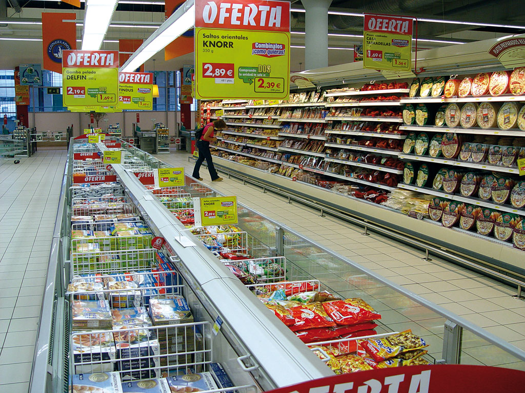
Even when there are a large number of suppliers within the same category and almost all are at the same level of competitiveness and all at the same time want to have the best portion of the shelf to display and highlight their products. This is when the retailer’s cash register begins to invoice and invoice the sale of privileged spaces within the linear.
But, which is the point between a good visual merchandising and the disastrous of becoming something (derogatory in nature), in the Spanish language aka «Mercado Persa»?

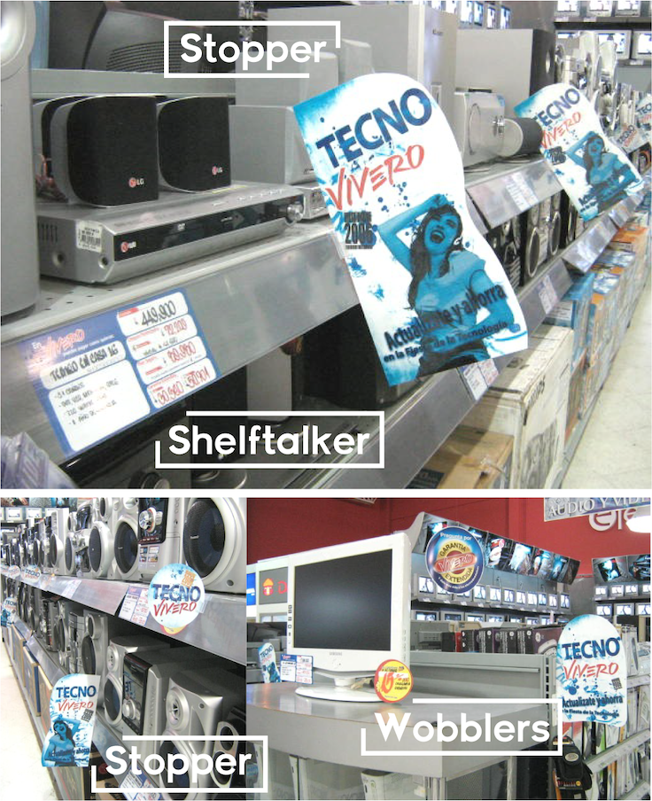
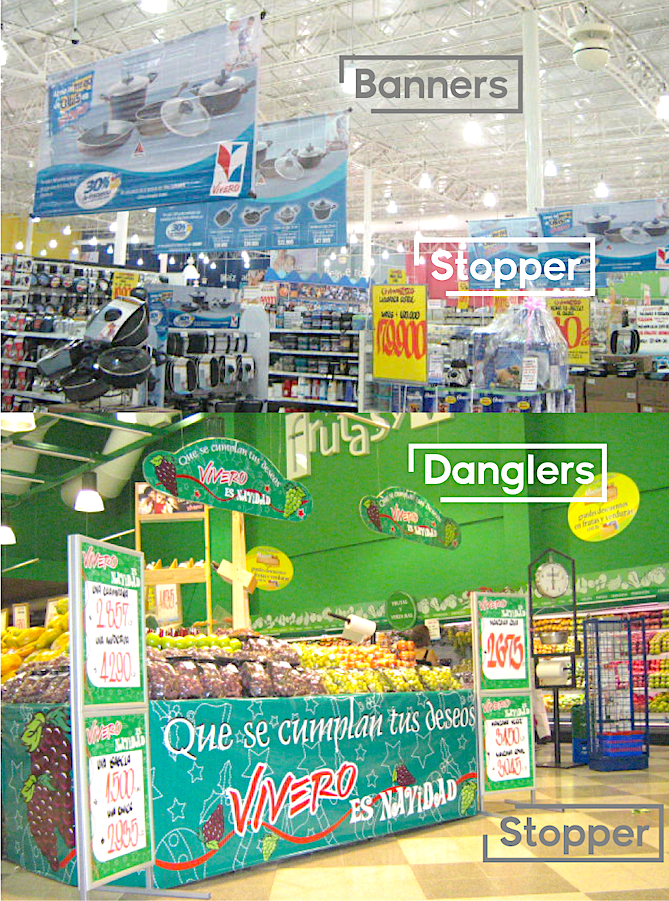
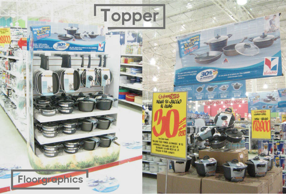
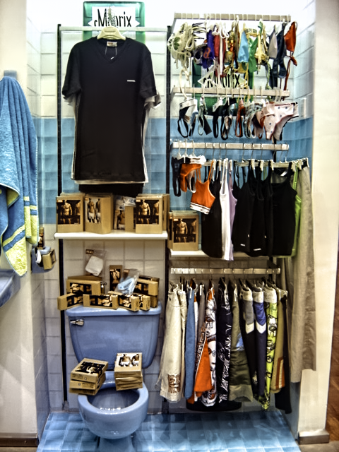
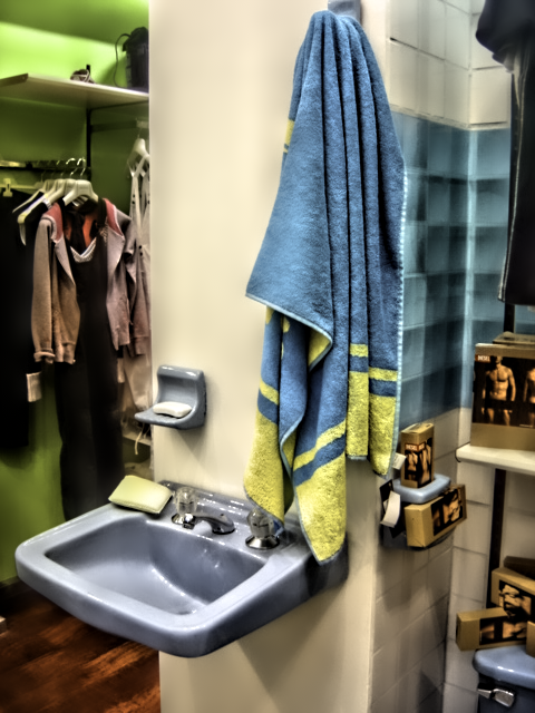
First things first, so we have to know what are the assets we have and which is the «promo» we have to communicate in the store (inside and outside in the window or facade). In a normal retail company you could have a large variety of elements for supporting publicity such as shown hereunder (images speak for themselves):
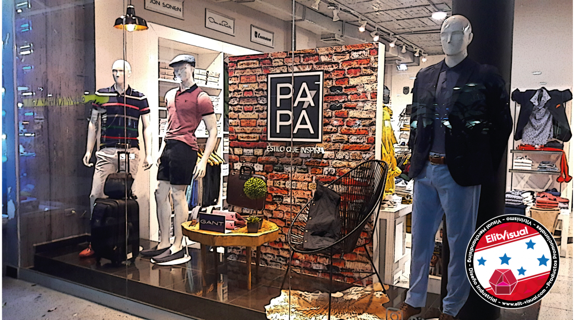
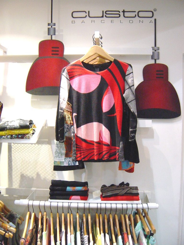
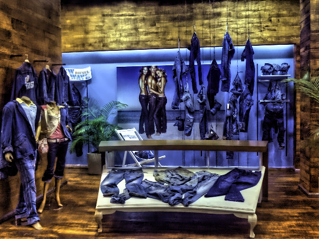
Different categories and sections, the same instruments and tools. Now, in fashion retail, for instance, we got this:
As a part of the campaign, you can promote each SKU among your visitors and consumers, and guess what! This is P.O.P. too:

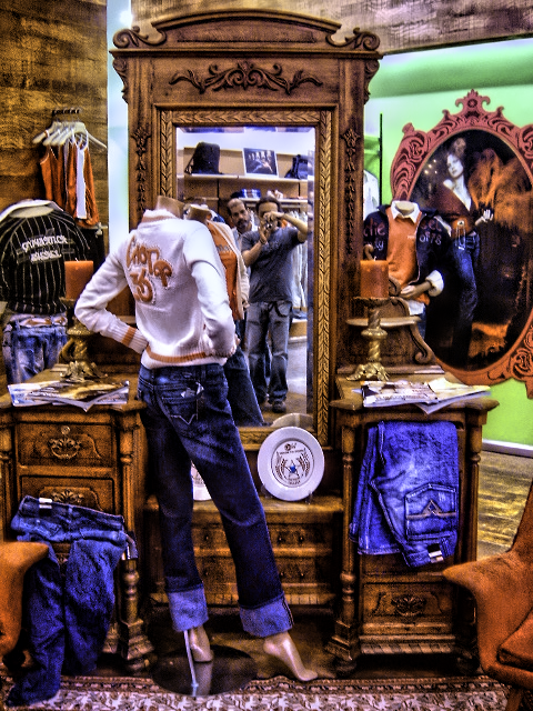
«Jake (con «Rabox») Yo en «Reggins!!». Rabox y Reggins dos de las referencias de jeans de la colección de ese año (2005).
Fuente: Foto y edición del autor.
In fact, basics are the same for each industry, but creativity must be the difference at the time you implement your visual merchandising ideas, being within the guidelines from marketing, brand, publicity (collection and campaign images), and consumer behavior.
Of course, you can sell the same product but aim to different types of buyers. At that time (2005) there was a huge difference between selling the same jean for a college university guy than selling it to a new professional or recently graduated in his first professional job.
Then we have the same campaign, the same product, the same p.o.p design (for setting and signage communication), the same brand and visual merchandising guidelines; but we have a different consumer and a different type of merchandising in a different point of purchase.
Now you can ask yourself this: Is that setting & communication publicity at the point of purchase relevant for your costumers, buyers, or clients? (just in case, all three are different, but we will talk about them in another post on this blog).
According to the theoreticians marketing writers, the answer is: YES!
Especially if the store brings to the visitor a big amount of greatest happiness and sensations and experiences, precisely those that the buyer is expecting to find in that place. Naturally, it would be traduced into increased sales.
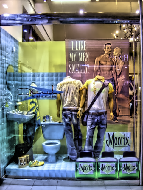
The window display can not scape from P.O.P. material and also many props you have to deploy just to catch attention besides the fact that you have to communicate exactly what the brand and its campaigns must be or have to say. (Remember the main target is to increases sells).
In this particular case, it was the launch of jeans collections SS/04.
Fuente: Fotografía y edición del autor.
To conclude, the most important aspect could be summarized as:
- To respect all campaign guidelines such as branding and visual merchandising.
- Smart use of resources: instruments, tools, and props available. This may include the re-use of the props by giving them a new «air» by the use of color and texture, just to transform them into a «new» prop.
- Finally, give it up to P.O.P. the strength and starring it deserves through the use of creativity, being careful to not transgress the visual merchandising, campaign, and branding guidelines.
In other words, it means «landing» the ATL advertising campaign into several «small pieces of communication» inside the store called P.O.P.
Now leave a comment and I will show the entire transformation from an advertising campaign to a P.O.P., through the use of visual merchandising concepts!