ASSEMBLY DATE: The day you face the truth!

Now that a reasonable time has elapsed in which all the pertinent actions for the production and manufacture of the elements designed and planned for the showcase have been carried out, the time has come to organize everything for the assembly day.

Even though it may sound like «piece of cake», it could be said that applying it is not that simple. In short, what makes it complicated might be the fact that there are many variables involved. Especially when you cannot be in real-time and the installations are carried out in different cities, or in different locations in the city at the same time.

Where is the PAPA signboard? Uhhh it «suffered» a delay!!! And in direct nobody realize that a power cord was floating in the upper left corner until we saw it in the photograph.
https://www.pinterest.es/ArtLex_/pins/

First, there is something that is fundamental and that is generally overlooked especially when visual merchandising services are provided and that go ignored by both the provider and the contracting brand.

This is the complete disassembly of the previous showcase, the one that is going to be replaced. It seems to be obvious but admittedly is something almost everybody gloss over. And the consequences are that lead times could be extended and inevitably affect the budget and your «goodwill» as a provider. And as a brand too, because you do not want to keep your window shop in a permanent and extended «out of service».

Empty, clean, spotless, and pristine space, that is the way you should receive the shop window in the assembly date!!!
http://www.elit-visual.com

So, there must be a plan for it. As a provider you will have the expectation of entirely empty space, so you can start with cleaning and painting if it is so required. Because the last thing you want is that painters and workers get in touch with mannequins and products. They are not trained for that, their knowledge is part of another field. The product could be damaged, or stained, or handle in a wrong way.

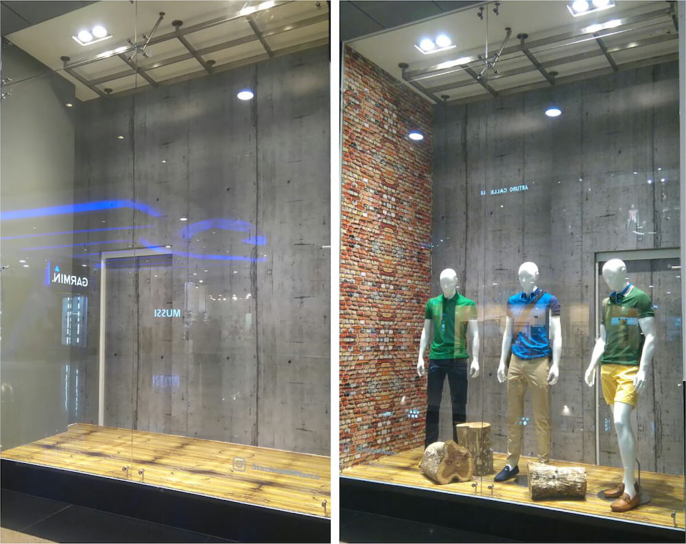
A good point to look through is the starter point, from up to down: ceiling first and then walls, and finally the floor. The glass is better to let it in the very last position, except if it has an awesome or complicated sticker vinyl design on it. Order, it all comes down to get an organized «step by step» and be plenty of discernment to full fill it.

At this point, all the decorative elements were not available, because of a delay caused by the lorry company. Those elements were on loan from a big and awesome decoration company. It took one day queuing, but worth it!!!
https://www.pinterest.es/ArtLex_/pins/

It can be pondered like the following way:

  • First: Overall cleanliness.
  • Second: Setting all protections before paint and then start with painting.
  • Next: Installing all wall stickers.
  • Then: Hanging all props that are floating: mobile, lamps, danglers, etc.
  • After that: Connecting and hiding wires and electrical sources.
  • Finally, the floor.
  • And the last thing: Mobilier and mannequins (already dressed).

All that to follow a sequence in which things installed will not be damaged. But as it was said before: «easy to say, then harder to do it!».

https://www.pinterest.es/ArtLex_/

Even with this, the list of all props, stickers, elements, and so; must be ordered in the way that would be easier to identify them and subsequently to avoid an unnecessary headache in the case something is missing.

There have been cases in that something does not fit into his place in the window shop or it is not according to the design. And then, just if this is the case, it is time to activate your mindedness and use your creativity to the fullest in order to circumvent the obstacle. Of course, must seek «where» was the mistake, and take action to solve it, just to know if it was your glitch and identified it before it gets huge and causes more damage in your future designs.

Meaning, if it was your mistake you must identify it and correct it, in order to see if it was the bad measurement taken, bad communication, or something wrong in digital files. And if it was the provider fault then ask them to fix it.

Another important item is the one that answer this question:

Do all elements and props fit through the window entrance? and before this question another one: Do they fit into the lorry? Inside the one that is going to be used to carry them to the store. Again all these could sound obvious, but in practice, almost anybody is aware of that.

https://co.pinterest.com/ArtLex_/visual-merchandising/

Been careful when installing all elements is a must. Because the more you care about the way you do your work then, the best it looks like when finishing it. It is a matter of value and not a cost. When you are careful you are professional, and you give value to your work, and then it shines by itself, and consequently, everybody realizes that.

A detailed work enhances the impact of your shop window and catches the attention of unsuspecting walkers, because of your work it became a brilliant and successful showcase and gives people a theme to talk about.

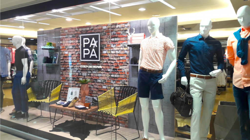
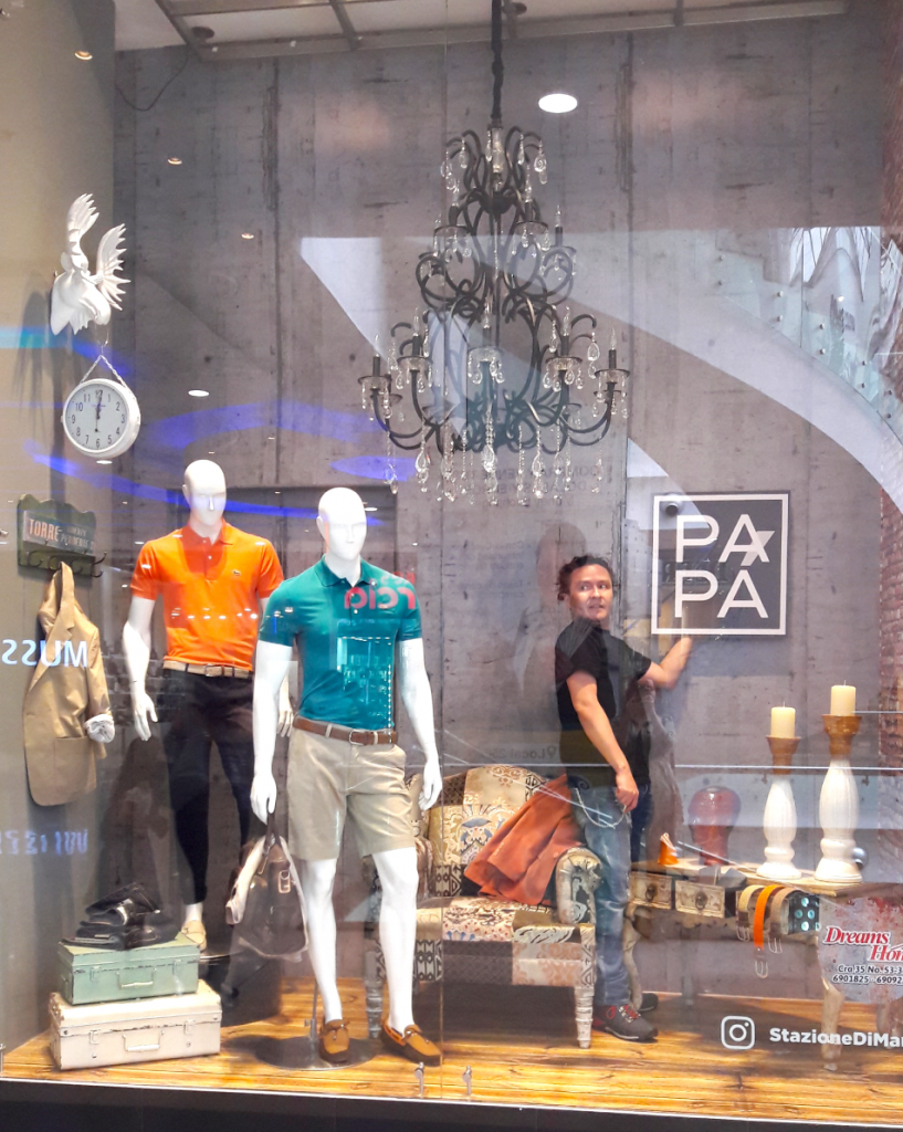
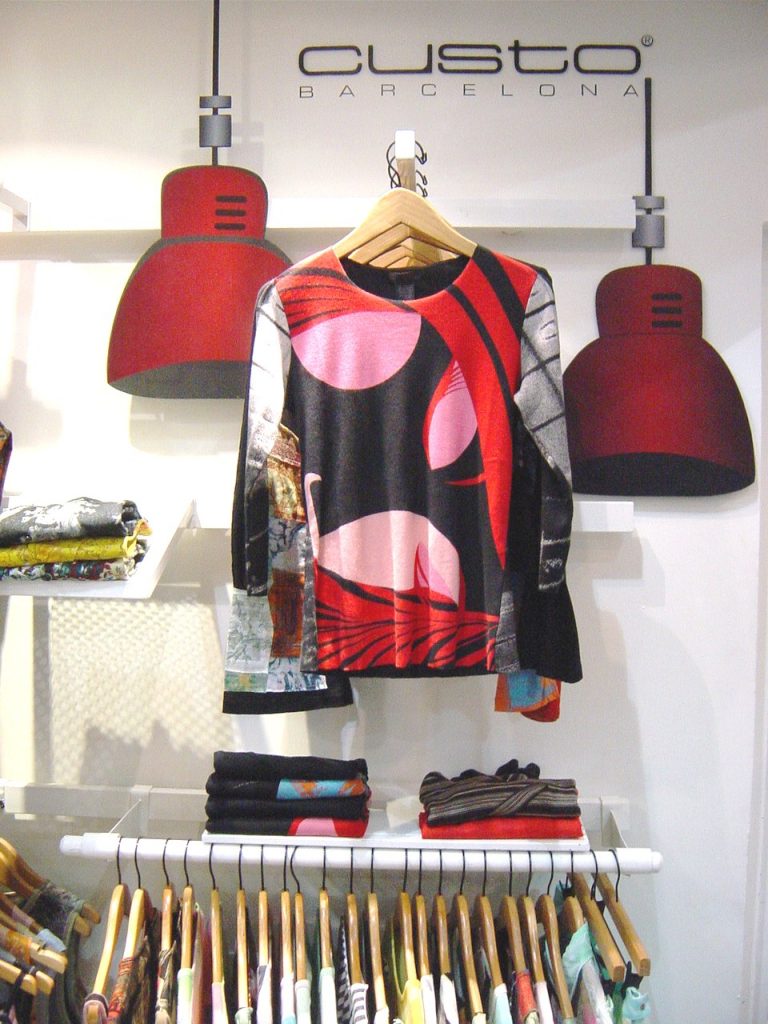
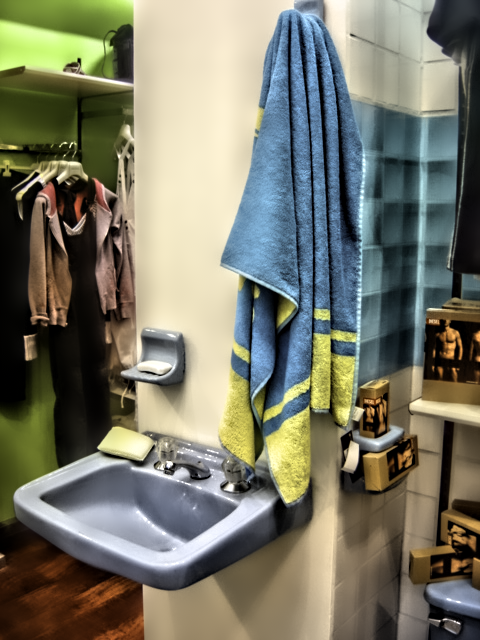
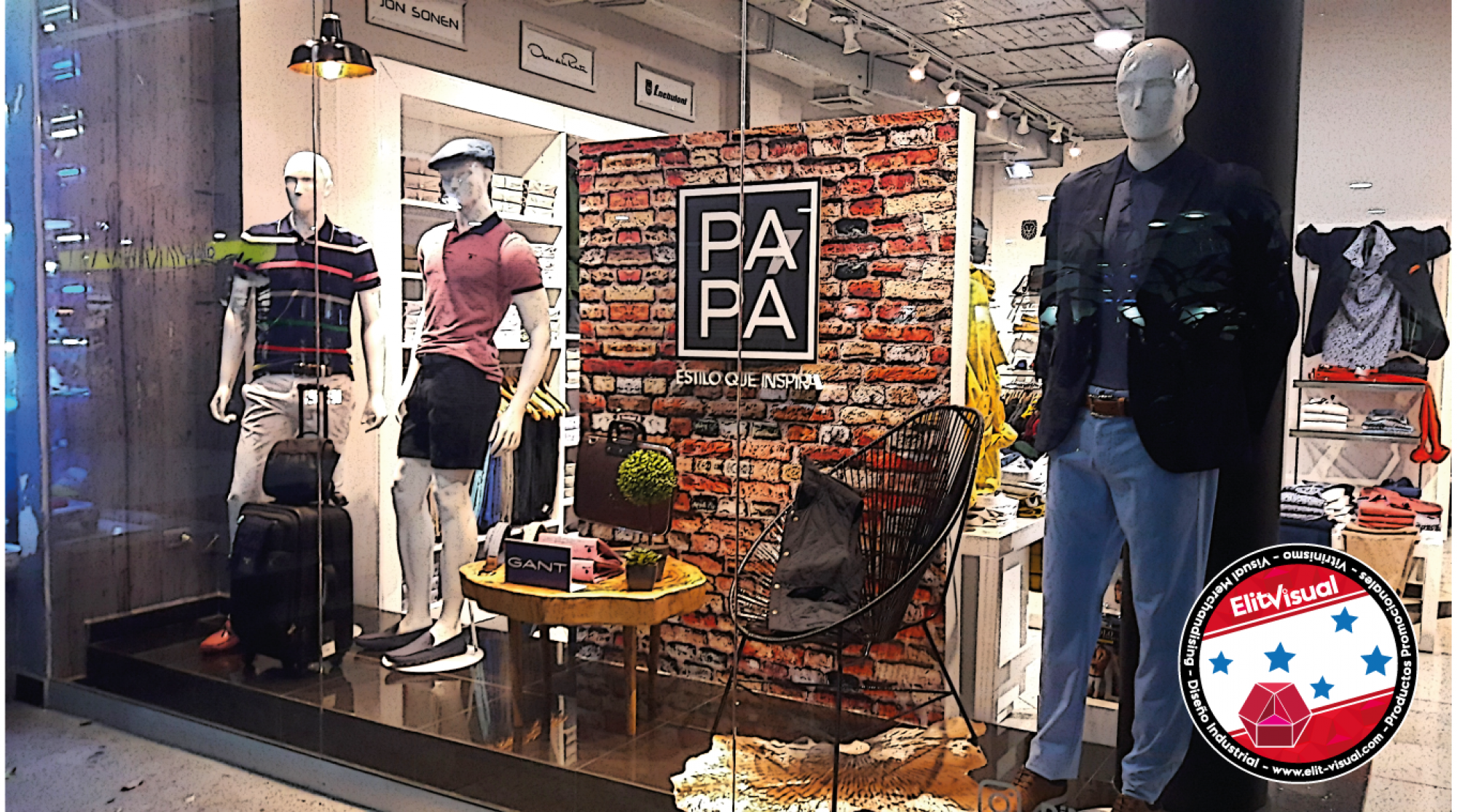
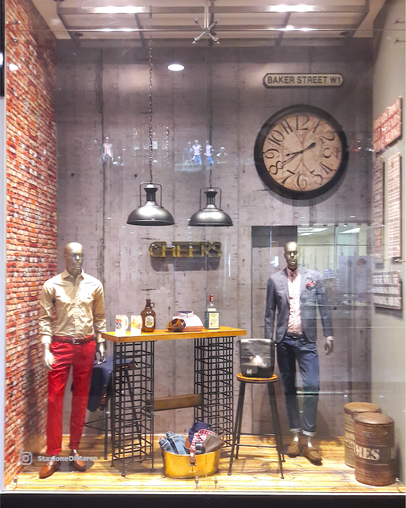
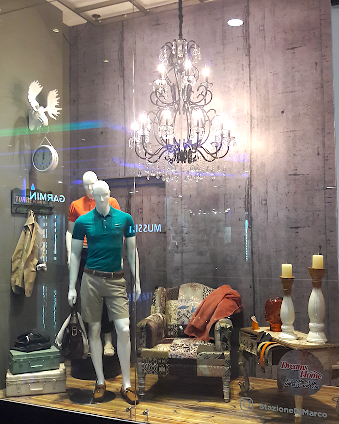
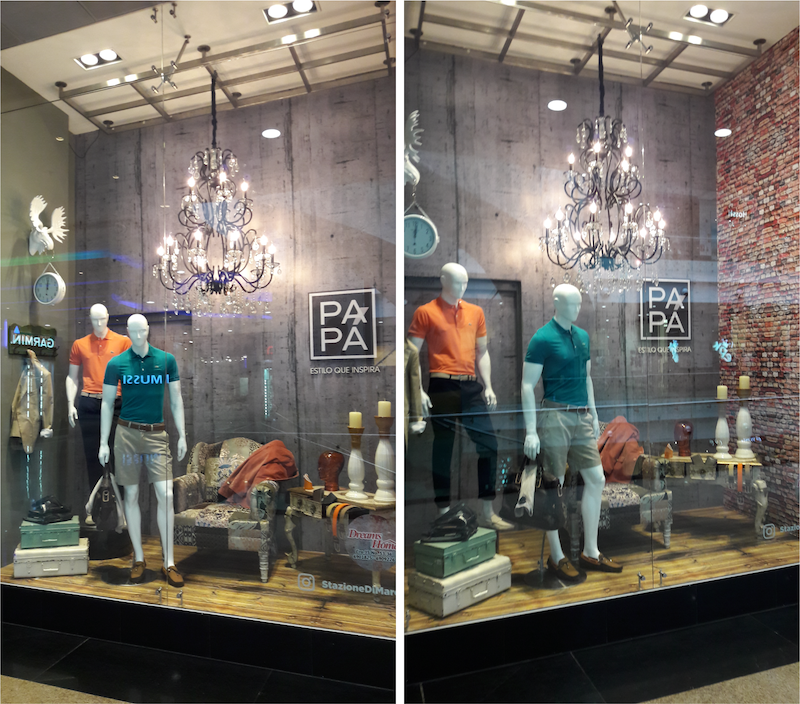
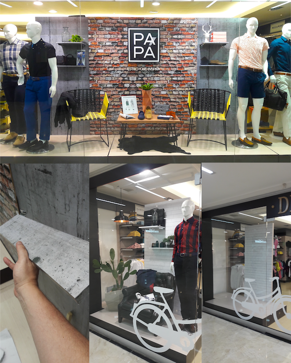
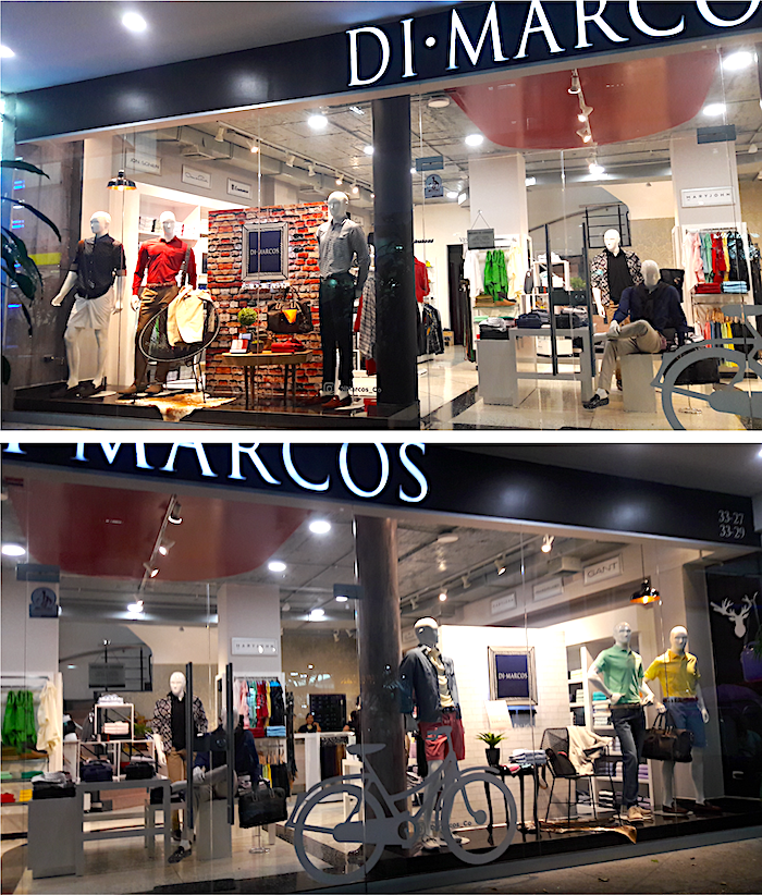
Mobilier and mannequins can be put into the case (the shop window). Already dressed, mannequins´ clothes must match with the palette (as far as possible) and the main design because they are the principal part of this story (for fashion retailing).

Of course, you can use the Color Theory you most like. You can go with Van Gogh´s theory, to harmonize according to his well-known knowledge in this matter, that personally I consider the best. Or you can apply the triads, the splits, or the use of analogs, all that theory you can pick from the color wheel according to Goethe.

Lights ON. As you can see, the signage is backlighted, and the power cord is covered with the same image from the background.
https://www.pinterest.es/ArtLex_/visual-merchandising/

Once you have all the display elements settled you can look from outside and make little adjustments that might have been required. It is a systematic and recurrent recourse the action of aligning all the nose and faces from mannequin groups pointing in the same direction. But «where» does this recourse come from? I do not have researched yet.

Lights OFF. Evident shadows cover the capital letters with the copy: «ESTILO QUE INSPIRA». Those letters have a thickness of 1 inch and were made of MDF.
https://www.pinterest.es/ArtLex_/visual-merchandising/

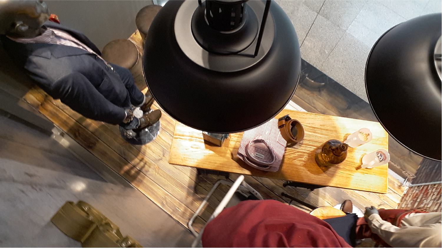
As it was seen in the previous photos, all those little details make a big difference altogether. If you start to get picky and analyze in a deep way you could find that there are many many little details that construct the whole package.

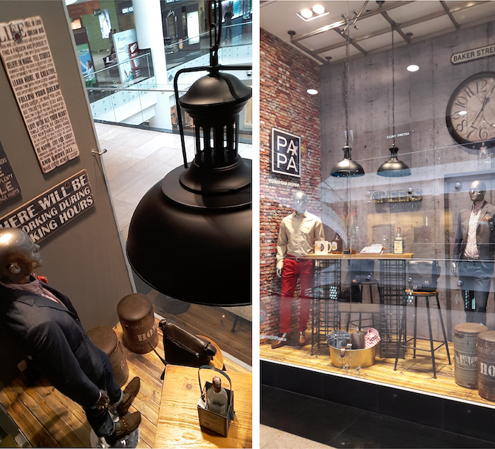
Finally, it is time for installing vinyl stickers on the glass. The small one featuring the campaign copy, or a promotion, or an accessory for the main decoration set. They are an excellent way to create that impression of depth. And playing with them is a ludic way too, depending on the manner you stick them on the glass. (Inside the glass, or outside, or both).

Vinyl stickers are an excellent and cheaper way to enhance a window display. You can get them from solid colors to printables designs you desire. And they give the designer a great number of possibilities to play with them. But «that is a horse of a different color» and we can talk about them in the next entry.

ADVERTISING CONCEPT INTO SHOP WINDOW (and window display)

The ad campaign made for ATL media (TV, radio, cable, streaming services, or even social media), must be implemented as it is, no matter what, into the shop windows. The problem might be (if there is any) that all advertising communication was planned, designed, and conceived for a large mass of people.

One of nine ad pieces for the Diesel jeanswear campaign (2005). One for each jean tag, each jean one different story, but all with that vintage atmosphere. In this case the jean Moorix. It was supposed that if you bought one pair of jeans, then you got the postal card with it.

BTL communication instruments allow you to get a chance to capture that very specific target that has become into your exceptional shopper, which could mean that you have the unique opportunity to put a spell, not only in your shrunk group of archetype costumers but over the ones that are not clients yet and are very similar to them.

Another postal card from the same Diesel ad campaign (2005), plus the jean tag on top.

Now, the big question is: How do I put all the ad campaign concept into the shop window?

Well, first as always, you have to look at the picture and realize and take note of what you see in that advertising photo:

  • A list of all representative elements.
  • The copy (written text that is to be printed, or text that is intended to help with the sale of a product).*(https://dictionary.cambridge.org/es/diccionario/ingles/)
  • The color palette.
  • The typography if there is one.
  • and finally the «leitmotiv» (of course is not referred to a musical piece but the symbols, signs, signals or decorative patterns and textures).

And then naturally, the specific publicity brief, the brand book, and the visual merchandising guidelines must be known and read. But before you run with the brief, is important to try to pick up the main concept from the ad without any clue and take some notes about the feelings, insights, and anything that cross your mind when you «watch» that advertise. Then you should read the brief and compare them.

«I LIKE MY MEN SMELLY! – Moorix». The copy for the jeanswear ad campaign from Diesel.
All current elements as a backing (the banner), foreground (the «Moorix» stickers) and the midsection (the bath and mannequins).

The point where your notes and the brief intercept is the key to start developing a true and real concept for the window shop. That concept is aligned with the ad and must have the same feeling (or flow) and the same foci (key elements), with the plus of a storyline that is very closer to the real and specific costumer that is part (client) of that store and by all means the product.

Do you remember the time at primary school when you learn about set theory? Here is the same mechanism, the common elements you get between your notes and the brief, are the elements you must use into the window. By doing this you guarantee that your proposal is flanked within the main communication objectives.

«You’ve never looked so good – Ronhar». The copy for this jeanswear ad campaign from Diesel (2005). All current elements as a backing (the banner), foreground (the «Ronhar» sticker) and the midsection (the vanity set, «ancient» curlers and mannequins).

This path is possible when you are «the man» (or «the girl») who decides anything for the shop windows in a store chain, and certainly, there are a lot of topics at this point hereinafter that we will see later. Things could be a little bit more complicated when you are not «the man» and you have to follow some visual merchandising guidelines.

Pages from Sanrio´s Fall Display Kit- 2004. Guidelines are just that: a guide!!! It does not mean that you have to do only and «exactly» what they say, or perhaps less.
You have to improve your own shop window using that guide even if it has a different shape or whatever the window is. The worst nightmare for a visual merchandiser: To make one different guideline for each store!!!

Those V.M. guidelines, that were made by «the man» become your handcuffs and shackles, and consequently, you have to blow up your mind and become immensely more creative. Evidently being «more creative» depends on your grade of excitement for overachieving on became the badass master of all chain of stores (which occurs once in a blue moon). On the other hand, you could do what the guidelines state and go down in flames by just doing nothing (or almost) but those things that were written in the guidelines. But as it was said: The ball is in your court. Which one do you decide to be? The badass? or Mr. Nobody?

Because now you are trapped between requirements and parameters that you have to fulfill and also trapped by the specific architecture from your store (things that you can not change), all those things are the reasons on which you have to rise your creativity to the stratosphere.

Here we have an example of some pieces from the proposal made by the agency for the PAPÁ ad campaign addressed to DIMARCOS, a multi-brand chain store. The agency: Papel Digital S.A.S.

Just think about it: Imagine that you are «the man» and have to write down the guidelines for a specific window display you have designed. So you just design one concept that has to be displayed in many stores around the world or around your country or in many places in your city. Those stores have different shapes, various sizes, peculiar layouts, diverse architecture, unlike physical and atmospheric conditions, and so on. Now you can wonder:

How long would it take to design distinctive windows displays for an almost infinite number of different shop windows? It could take a veritably a huge amount of time and energy. Notwithstanding it would be possible to some extent, that is not constructive or prolific in terms of economics and health.

This was the draft for the three types of shop windows. With a full enhancement keeping the budget out of mind, in the meantime. Papá campaign for Dimarcos, a multi-brand chain fashion stores in Colombia-South América. By: Elit Visual S.A.S.

Now that you have embraced the main concept and have a clear idea that would become into a story it is time to land it. If you work for a franchise surely they will send you some elements like banners and stickers, and probably some props that will be useful. So you have to complement the shop window as it was a scene from that story (I think it truly is). And the window would be the stage.

In addition to it, you must show a clever move with the budget just to maximize the performance, if you have the skills and permissions to do it.

Finally the approved + a final adjustment.

The next step is to get the ball rolling, which is not easier than it seems to be. Because in this step you have to achieve that your result gets the most proximal to the draft you just presented. Every designer knows the big difference between a computer design and a final real-life design. Especially all color aspects (the color palette), what is known as RGB and CMYK color modes. Also the big difference between proportions and scale from all props and of course, the How to.

Those mistakes are more common than you think, particularly in rookie designers:

  • Asking for more elements than the real needed.
  • Bigger/smaller elements than they really are.
  • Substantial differences in how it looks, and possibly how it feels.
  • Choosing the wrong materials (not only in their characteristics but their cost too).
  • «Ideal props» impossible to make (or almost).
  • Difficult installation procedures that become nightmares for the workers as well as the designer.

Those mistakes could result in a budget overload for sure. Every penny you save in the production process should be used to reinforce the window display. By the way, there is another common rookie mistake (derived from the previous) because a rookie usually tends to get cost down and in a childish way assume that is the correct way.

2017 – Just before it was finished. DIMARCOS – Bucaramanga, Colombia.

Being honest that is not good, because every penny you save, it must be spent anyway to rise up the look and feel from the window display. It is known that you have a cost structure for every store and for every shop window you design. If you reduce the budget it means that you are not growing. You need to spend more and more every year. If you do not spend all your budget, the next year it would be reduced and then you would be in big trouble.

R.E.M.E.M.B.E.R.: Expenses are an extremely good signal for the health of a business. If you do not have expenses, it means that you have no money to spend. Crucial. The window display and all communications items (e.g.: p.o.p material, visual merchandising, ambiance and setting adjustment, etc) are expenses. They are not investments or stakes, never!

Incidentally, production processes require from the designer a big amount of expertise, mostly to avoid the worst fear scenario in which you are fooled and also your budget by the suppliers or contractors. Manufacturing quality is a must mainly in top brands. Because if it is not that way the brand might look fake or phony.

Here we have an example of a commercial alliance between Dimarcos and Dreams Home (a top high-quality interior design supplier). Heaven knows the terms from that negotiation, but the truth is that it was made by the marketing manager and it worked perfectly.

In the case, very recurrent, that the budget is not enough, you still have some trump cards:

  • To ask for a budget addition.
  • To inquire about an existent commercial alliance between brands made by the marketing department. Brands that have what you need for the window display.
  • To invoke the owners for building partnerships between their social contacts (friends, partners, colleagues) that probably have brands and companies who share the same target but in different categories that could help with elements for the setting, with the minimal request in return for it. Which is the same as something called: a favor.

When you have passed all of these things and the suppliers and contractors are working on/in/over the elements you need, it is time to say you are done… But not at all, because you still have a pain in the neck that is sprouting and you still have not realized it is coming!!!

I mean the crunch time that will arrive the day you have to install all that you have designed. That topic deserves its own blog entry because setting up the window display will let you wrecked!!! Or maybe just worn out…

From ATL advertising to BTL (Visual Merchandising)

ATL and BTL are some of the most known acronyms for these 2 realms of communication: Above The Line and Below The Line.

Communication instruments in modern companies have evolved rapidly since the seventies (70´s), in which the ATL media had hoarded the advertising scene with approximate participation of 80% vs. 20% from BTL instruments. But along the eighties, they started to scratch this value rising up to 40% and finally with the new century became the 70% BTL vs. 30% ATL. *Salen, H. (abril, 2008). Seminario Internacional Merchandising Activo. Merchandising visual, de seducción: una necesidad actual y creciente.

This means that with the new century most companies made a bet for BTL communication: salesforce, window display, Visual Merchandising, public relationship, patronage, and sponsorship. The communication at the point of purchase (which is the one we are going to talk here in this blog) might have many topics or classifications -it depends on the author- but here, we are going to get straight to the point:

Communication at point of sale could be divide into two big main blocks, the signage communication, and the setting communication. Both are important and they must be balanced.

Ambientación con dos «luminarias» planas en mdf y señalización del corner Custo Barcelona con la marca en acrílico, en una tienda multimarca. Año 2004. Fotografía del autor.

To balance them is a very difficult thing, especially in supermarkets and department stores, first and fore more in the food category, as shown below:

Fotografía de un supermercado tipo español con carteles de señalización de precios y ofertas y al fondo señalización de las secciones.

Even when there are a large number of suppliers within the same category and almost all are at the same level of competitiveness and all at the same time want to have the best portion of the shelf to display and highlight their products. This is when the retailer’s cash register begins to invoice and invoice the sale of privileged spaces within the linear.

But, which is the point between a good visual merchandising and the disastrous of becoming something (derogatory in nature), in the Spanish language aka «Mercado Persa»?

Recuperado de: https://elmasclet.files.wordpress.com/2015/05/phoca_thumb_l_marrakech-mercado-2-marruecos_800x600.jpg

First things first, so we have to know what are the assets we have and which is the «promo» we have to communicate in the store (inside and outside in the window or facade). In a normal retail company you could have a large variety of elements for supporting publicity such as shown hereunder (images speak for themselves):

Fotografía tomada en el año 2006, en la sección de tecnología de una cadena de tiendas por departamentos ubicada en Colombia. Fuente: Fotografía y edición del autor.
Fotografía del año 2006 en la categoría de frutas y verduras de Almacenes Vivero durante la temporada navideña. Fuente: Foto y edición del autor.
Punta de góndola en la sección de hogar. En la foto la exhibición pagada por un proveedor de utensilios de cocina junto con exhibición adicional sobre el pasillo, próximo a la punta de góndola. Fuente: Foto y edición del autor.

Different categories and sections, the same instruments and tools. Now, in fashion retail, for instance, we got this:

Año 2005, (Diesel Flagship) además del material P.O.P. de señalización también tenemos el de ambientación, en este caso particular, la silla blanca playera estampada con el nombre de la campaña, un letrero hablador y una imagen publicitaria de campaña. Adicional el show de exhibición con producto tanto en el muro como con una mesa adicional de exhibición. Fuente: foto y edición del autor.

As a part of the campaign, you can promote each SKU among your visitors and consumers, and guess what! This is P.O.P. too:

Material P.O.P. promocional con el nombre de la referencia del jean en el que se lee:
«Jake (con «Rabox») Yo en «Reggins!!». Rabox y Reggins dos de las referencias de jeans de la colección de ese año (2005).
Fuente: Foto y edición del autor.

In fact, basics are the same for each industry, but creativity must be the difference at the time you implement your visual merchandising ideas, being within the guidelines from marketing, brand, publicity (collection and campaign images), and consumer behavior.

Of course, you can sell the same product but aim to different types of buyers. At that time (2005) there was a huge difference between selling the same jean for a college university guy than selling it to a new professional or recently graduated in his first professional job.

Then we have the same campaign, the same product, the same p.o.p design (for setting and signage communication), the same brand and visual merchandising guidelines; but we have a different consumer and a different type of merchandising in a different point of purchase.

Now you can ask yourself this: Is that setting & communication publicity at the point of purchase relevant for your costumers, buyers, or clients? (just in case, all three are different, but we will talk about them in another post on this blog).

According to the theoreticians marketing writers, the answer is: YES!

Tomado de: Rivera, Raul F. (2019). Flashcards Visual Merchandising. ArtLex. pag. 29. Bucaramanga, Colombia.

Especially if the store brings to the visitor a big amount of greatest happiness and sensations and experiences, precisely those that the buyer is expecting to find in that place. Naturally, it would be traduced into increased sales.

That is me in October, 2004. I am in the mirror with the bald man, the outsider collaborator from who I learned a lot, particularly in the effective color usage. By the way, you can get more pics like this on: https://www.pinterest.es/ArtLex_/

The window display can not scape from P.O.P. material and also many props you have to deploy just to catch attention besides the fact that you have to communicate exactly what the brand and its campaigns must be or have to say. (Remember the main target is to increases sells).

This window with stickers, banner and props, according to the advertising campaign.
In this particular case, it was the launch of jeans collections SS/04.
Fuente: Fotografía y edición del autor.
After the window display launching campaign, all the props were re-located inside the store in the beachwear and underwear section. Fuente: Fotografía y edición del autor.

To conclude, the most important aspect could be summarized as:

  1. To respect all campaign guidelines such as branding and visual merchandising.
  2. Smart use of resources: instruments, tools, and props available. This may include the re-use of the props by giving them a new «air» by the use of color and texture, just to transform them into a «new» prop.
  3. Finally, give it up to P.O.P. the strength and starring it deserves through the use of creativity, being careful to not transgress the visual merchandising, campaign, and branding guidelines.

In other words, it means «landing» the ATL advertising campaign into several «small pieces of communication» inside the store called P.O.P.

I forgot to say that this toilet bowl and lavatory were unused. It was stowed in the warehouse because the construction manager bought three instead of two when the the store was designed and built. So, I saw it and I used it. Fuente: Foto y edición del autor.

Now leave a comment and I will show the entire transformation from an advertising campaign to a P.O.P., through the use of visual merchandising concepts!